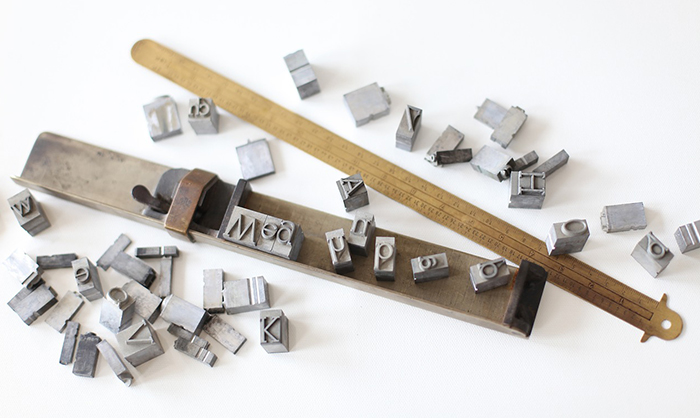
The DOs & DON'Ts of TYPOGRAPHY
When I asked a bunch of people what they thought when they first heard the word “Typography”, I couldn’t help but laugh. Some people figured “typography” was the art of making spelling mistakes. For those of you who don’t know, typography is the style, arrangement, and appearance of text.
If you think about typography, it’s actually everywhere, from our phones and laptops, the websites we visit newspapers, and billboards. The importance of typography often works subconsciously; it helps convey the message you want to be heard through intelligent and well-thought-out styles of writing. Good typography not visible often, but bad ones are!
Read also: The Ideal Length Of Everything Online
The way you present text actually a substantial subliminal effect on your readers. For example, if you emphasize the word ‘best’ on the phrase “Grab the BEST burger in town” you are likely to get more attention than if you had written it plainly. So what separates good typography from bad? Here’s a list of do’s and don’t’s when working with typography.
Do’s:
1. Use light texts on darker backgrounds, focus on readability
Of course, this isn’t always the case, but exercise this whenever you can. It articulates the message better. It just makes the writing pop out more, you know?
2. Mix and match a variety of typefaces (fonts) together
Fun fact: What we call fonts are actually called “typefaces” *mind blown* Fonts are actually the format the text is saved as. So when I say mix up the typefaces, I mean to try different styles of fonts together. Some universal combinations go well together like bold and block letters paired with thin and cursive.
3. Change font sizes for emphasis
No one uses the uniform font size anymore! Blow up words you want more eyes on. You could also try changing the color if changing the size doesn’t look good. See also: The Ideal Length Of Everything Online
4. Screw the conformist line spacing
Standard line spacing is for squares. You want to really push those lines close together to un-square. I normally do this by dividing my lines (or words) into different layers. This way, I can easily change my typefaces too. Yay!
5. Dress your type up a little
It never hurts to add a few adornments to your text. Put a squiggle on it or maybe an asterisk. Dashes work the best though. You could also try dividing your texts (in a relevant way) with lines or dots.
See also: A Language On Its Own: Bangla Typography
That sums up the little tips and tricks I go for, but when I do exercise these, I make sure I don’t go overboard with them. There are far too many occasions when my texts just looked like word vomit. Here are some tips on how to avoid that:
Dont’s:
1. Never use colors that are similar to your backgroundsAnd I mean never. Never use peach on white backgrounds, white on really light pinks or mints. These combinations may sound enticing (to our feminine designers out there) but trust me, I have tried and failed at making them work. Note that this doesn’t mean you can’t use light tones; the colors just have to be dark enough for the types to be easily read.
2. Never use Comic SansJust no. Please. It just doesn’t go with anything. Do you want to market a product? Post an announcement? Ask a question? Post anything serious? Is this really the font you want to use? REALLY? Let me give you some examples: BUY NOW! Or SAY NO TO DRUGS! I rest my case.
You should also avoid using novelty fonts that distract readers too much.
3. Don’t “emphasize” words too often
You don’t want to go overboard with different font sizes or colors. Use them sparingly. One word-sized/colored differently per sentence, every two sentences. That is the rule (some may say otherwise, but I think they are wrong).
4. Avoid inconsistency with the line spacing
While it’s great to customize your line spacing, you should always stick to certain spacing (pattern) for every content you make. Don’t push two lines close together and push away the other two lines. It confuses the reader about what the unnecessary space is for. See also:
5. Too much makeup is bad for the type
Just like with people, you want to go easy on the accessories for your type. Too many squiggles and dashes may end up “comic sans” -ing your text without using it! You’d never want that, would you?
Well, that’s about all you need to know (for starters) to make a decent typographic poster. These tips and tricks work quite well for me while others may work better with equally sized fonts or uniformed line spacing, it all really depends on what you think looks good and what actually works for your audience. After all, you’re the designer! So experiment, see what you like, and most importantly, have fun with it. You can even go crazy with comic sans if you really feel it’s appropriate. That’s totally your choice.
Check out WebAble team’s typography work on infographics & data visualization


